SAM WEY: Rumbleverse Level Design Case Study
Screenshots & Contributions
Screenshots
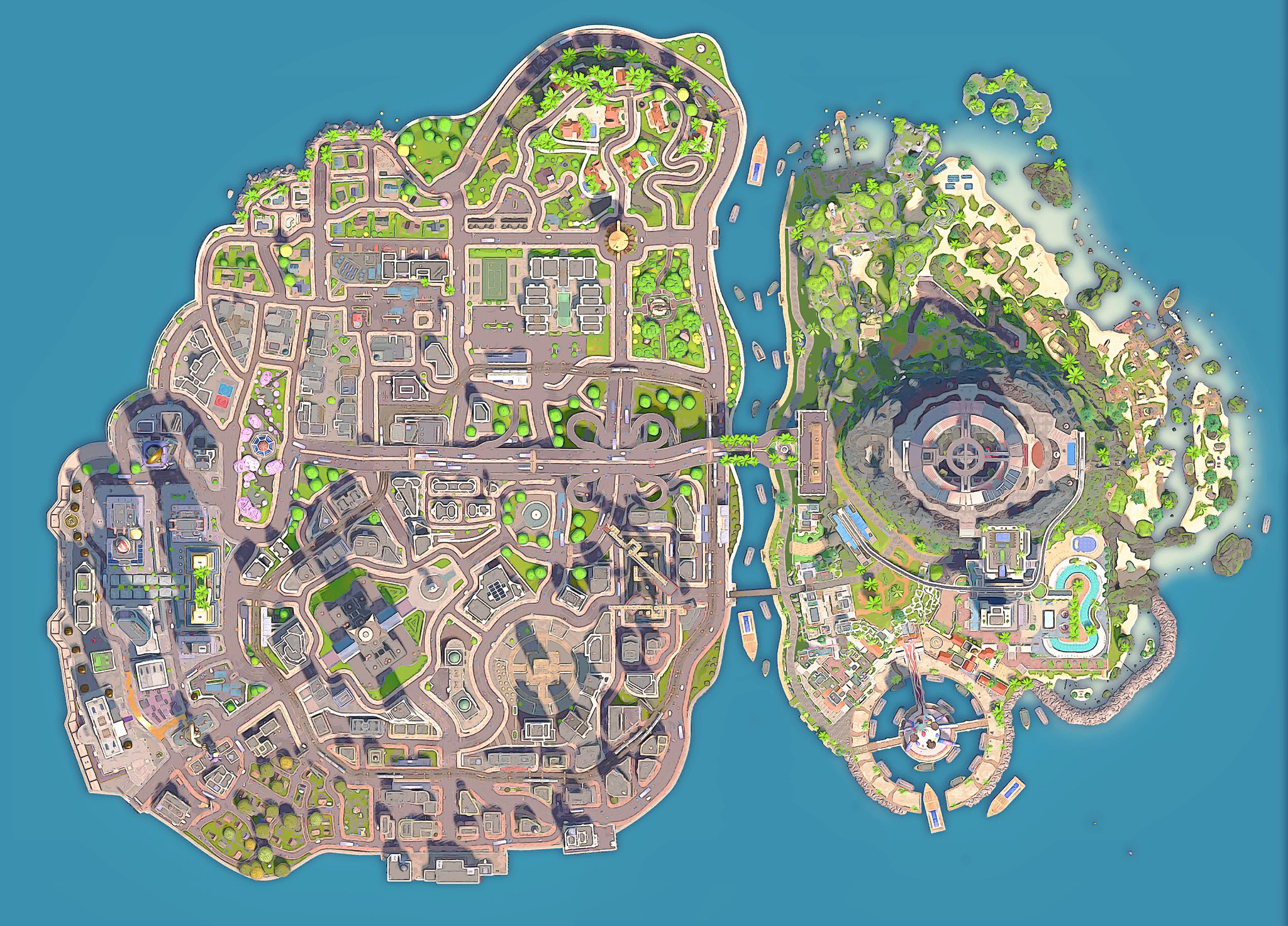
Grapital City and Season 1 Expansion: Top Down
Grapital City: South Westward Panorama
Grapital City: North Westward Panorama
Grapital City: North Eastward Panorama
CONTRIBUTIONS
For most of the production of Rumbleverse, I was the only level designer. I carried level design for a dense, sprawling, battle-royale island and the broad strokes of the layout of the Season 1 level expansion. At a high level, Grapital City was laid out with Kevin Lynch's city planning principles in mind, where the layout is broken down into paths, edges, districts, nodes, and landmarks. In this case, the distinctive landmarks were visible to the player as they scanned the city skyline and the paths were the main roads between these landmarks. All the space between these primary elements tended to be filled with narrower pathways and denser "jungle" (to borrow a term from the MOBA genre). A visual hierarchy of information emerged from these POIs, wide main roads, and narrow alleyways. In this way, the space gained a pacing and rhythm as players moved through the space. Lines of sight along these main roads to POIs helped keep the player oriented.
As a consequence of this structure, the more visually-dominant landmarks tended to be hotter landing locations with a higher risk of an early KO for the sake of better loot. Each POI was laid out to be visually distinctive with interesting pathing options for climbing and platforming. Star coins were placed to convey pathing options, springboard arcs, and reward players with Star Meter. All rooftops had enough surface area to accommodate combat mechanics. Springboards were used as a faster traversal option which compounded elbow drop damage. Final ring placement constrained the space in interesting ways for the intense final moments of each match.
Through the course of production, I developed a close working relationship with the art director, concept artists, outsource manager, and environment artists. In a game where the player could climb on and fight on nearly every surface, close collaboration was necessary to ensure the design intent of each space was maintained and felt good to interact with from the early stages of concept art through to final implementation.
I contributed technical and workflow expertise in numerous ways; initially overhauling an inflexible workflow that was entirely blocked out in Maya and brought into the editor as a single piece of blockout geometry. All roads were handmade. I transitioned this to a modular, in-editor workflow and pushed through the adoption of a spline-based road tool. Unreal's World Composition enabled open-world streaming. This empowered us to iterate quickly, modularly, and concurrently.
Later in the production, I mentored and managed supporting level designers. First, developing a curriculum and guiding a QA Analyst through a level design mentorship program. I guided this apprentice through a trial period until she was promoted to a junior position. I also trained and managed a mid-level Level Designer who was new to Unreal.
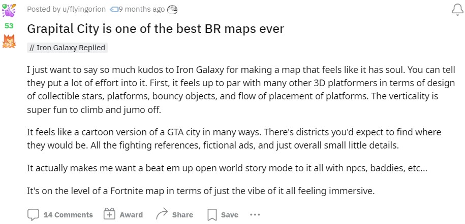
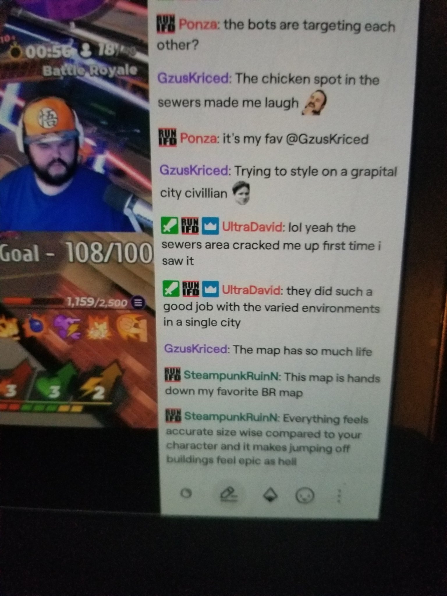
I'm extremely proud of the vibrant world we created in Rumbleverse. While other battle-royale islands spread themselves across a sparse landscape, we lovingly crafted a dense cityscape that was full of humor and character. With a small team and on a short timeline, we designed Grapital City, a canon barge, and a vacation island expansion for the first season of live ops. Most importantly, the gameplay spaces were fun and reinforced gameplay mechanics. The game was critically well received and a vibrant community developed before its premature cancellation.


